Converting web traffic from “unknown” to “known” (aka a lead) is as much of an art as it is a science. It all comes down to understanding why a person would be willing to give you their information.
To convert unknown traffic into a leads you have to give them something they want.
It’s really that simple.
All too often businesses focus on what they want (more leads! more revenue!) and they fall into this rut of creating content that is sales-y, uninteresting, and fully self-serving.
Marketers should view their work as a behavioral experiment. My favorite part of marketing is that it’s a bit of social psychology, sociology, and anthropology (finally! I can put that anthropology degree to use!).
It’s important to note that conversion can mean different things. For most people it means getting someone to take the action you intended them to – mostly fill out a form to download information or reach out via the contact us. Sometimes it may mean you want a visitor to stay on a page for a certain amount of time (engaging with content), or go through a specific user path. This post views conversion as a form fill.
Before I get into the types of content you should create in a full on content strategy post, this post discusses how I optimize the flow from landing page (first entry point) to capturing their information.
A visitor has landed on your page – now what?
CONGRATS! 🎉 You’ve driven traffic to your site. Not the easiest feat for a B2B marketer (well, as compared to a B2C marketer), but what’s next is important.
a) You can come on strong and ask them for their information immediately

b) You can create an engaging user path that gets them to want more

Neither method is wrong. (Yes, despite my gif of the little girl pushing off the advances of a little boy.)
If a visitor lands on your page with the intention of downloading or contacting you – amazing! You’ll need to have a form fill above the fold. So, for those campaigns where you are offering something – such a piece of content, demo, freebies, absolutely meet them out of the gate with a form fill.
For the less inclined, you will need to engage them until they are a bit more comfortable. There’s three things you can keep in mind when you’re building out your website or landing pages.
Create a clear user path.
The worst is when a visitor doesn’t know where to go next. When there’s too many choices – you’ve lost time of them attempting to select what’s next.
Think of it as a store. Someone walks into your store. You don’t know who they are or even why they might be there, but you want to make sure you have some clear options for them. Would you rather they get stuck at the entrance reading all the signs as to where to go, or do you want to lead them toward the cash register with the stuff they need?
- State your point of the landing page up front – succinctly note what you do that benefits them and what you want them to understand that would help them choose you
- Use language from their point of view – they aren’t looking for your jargon and may not understand
- Don’t go on forever – the forever scrolling page needs to die. Period. And don’t too much content on a page (the word barf) – see the next section
- Have a clear CTA – It needs to be visible and anyone using it should know what they are getting themselves into. See below
5/ Think “Call-to-value” not “Call-to-action”
— Marketing Examples (@GoodMarketingHQ) October 18, 2019
Buttons which amplify “value” over “action” usually perform better.
“Create Your Website” is more enticing than “Sign up now”: pic.twitter.com/kARdQJvRhD
Don’t bore people to death.
Visitors want engaging content. That set of long paragraphs that details everything your product does – save that for a secondary page.
If your goal is to keep users engaged within your site, you will need to look at your bounce rates.
For the pages where bounce rates are high:
- Identify how visitors landed on your page. If they are searching for answers and landing on your page and your page isn’t clear about the answer up front, it’s no wonder they are bouncing.
- Optimize page content to provide answers. These can be for frequently asked questions about the page topic and related to your product depending on the page intention.
- If you’re ranking for something you’d prefer not to, adjust your SEM and SEO strategy. You’re going to rank for low volume stuff from time to time, it’s inevitable, so don’t spend too much time. Just solve the large anomalies.
If bounce rates are fine and you’re not getting the traffic to engage and convert as you’d like, you probably aren’t serving content that’s compelling enough.
Keep it simple, stupid.
It should be easier said than done, but don’t have too many call to actions with different intentions. Some popular choices for CTA categories:
- Contact Us
- Free trial
- Get a consultation
- Schedule a Demo
- Read more
- Learn more
- Buy now
As you can see, there are a lot of options. Having too many on a page is clutter, can be confusing. Keep it simple by asking yourself what the best outcome you want from a page and leverage that one. Then figure out what the “softer” alternative is. If you want someone to contact you, that can be a big ask, so for those not ready, it could be “check out how it works” that leads to some social proof.
Ok, but why would they want to give me their information.
You want to put a ring on it, but before that, you have to officially ask them out and have them accept.
So, you have to provide value. If you aren’t providing value, why waste your time? A bunch of throat clearing and air never helped anyone – including yourself.
If you are providing value, here’s some things to keep in mind to make that valuable content more compelling:
- Likability and relatability – Understanding your potential buyers is important, and know who they are, what they like, and how they buy is key. If you can build a brand that has strong likability and is relatable, you’ve already lowered the barrier a little.
- Authority and social proof – Understand what would make someone believe your product or your content should have a voice. This can be through case studies, quotes, or data.
- Ask for something small first – Instead of asking for email, name, title, company, mother’s maiden name, social security, etc… ask for 1-2 things. Small commitments can lead to greater commitments later on. Maybe even that yes to subscribing to a newsletter.
For those of you familiar with Robert Cialdini, PhD’s seminal classic, Influence: The Psychology of Persuasion, these are all “tricks” out of his book. (If you’re unfamiliar, read this short page on his site about the principals of persuasion).
Beyond making your content more appealing, you can also apply some simple principles.
- Use the idea of scarcity – If the form fill is to register for an event (digital, live, etc), use language that indicates that they need to act now. Just make sure it’s used sparingly, or you’ll de-sensitize the language.
- Leverage reciprocity marketing – Give them something before they can give you something. An example may be to give them a shorter version of a piece of content you have created without asking for their information (click download, send them to a thank you page). On the next page, ask for their information for a newsletter or another piece of content. It’s low risk, and possible high rewards.
And finally, reduce friction. This should go without being said. As stated above – keep it simple and ask for something small, first.
Ok, but what if they’ve bounced? Now what?
It’s worth noting that it may not be necessary to bring them back. But, if you want to get them back, there’s two things you’ll need to address:
Baby, I want you back
Don’t beg. I repeat, don’t beg.
Just kidding – you don’t even know who these people are, so you can’t even do that. Ok, that was a bit cruel, but regardless, there’s 2 things to try:
- Retargeting – Remember, if you. do bring them back, you’ll want to make sure you addressed your site content to show that a) there’s new information and/or b) something has changed
- Optimizing the inbound channel – Identify where you’ve had high bounce rates, optimize the ways in which they inbounded, and provide value then
How do you measure success of returned bounced visitors?
- Go beyond Google Analytics – it may not give you all the info you need, so consider a handy tool like, Heap or MixPanel, to dive deeper
- Create segments to measure – identify those who bounced and to what pages see if those users come back after you addressed the issues and if they are converting
- Watch engagement and conversion rates for those segments – Note what % of people have returned, if they staying on the page, if the bounce rates as high, and if those people converting
Note: A bad bounce rate doesn’t necessarily always mean that your page is performing poorly. For example, if your page answers a question a visitor may have immediately, and there’s no need to go any further – then of course they’re going to surf away. These short answer page serve a purpose too, so don’t discount that when you’re looking at the data.
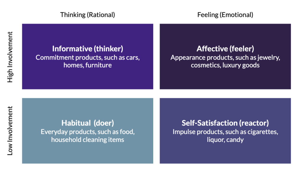
Converting visitors is far more difficult for B2B (specifically, enterprise software) than B2C and requires a lot more patience. Some B2C purchases (homes, life insurance, cars) may evoke similar buying patterns to B2B. But it’s important to be aware that it high involvement and rational purchase, see FCB Grid below, which makes lead gen a trickier task.

Many B2B marketers – I’m looking at you early stage start-up marketers – will not be able to get this granular, but keep these best practices in mind so you can pull them out of your back pocket as your team grows or you find more time to focus on conversion. Good luck!
Resources
- Conversion Rate Optimization by Unbounce
- Psych’d Funnel Conversion by Andrew Chen
- Strategy and tactics for increasing conversion by Lenny Rachitsky
Header Photo by Markus Spiske on Unsplash
